Manchester City have officially unveiled their new home kit for the 2024/25 season and it’s safe to say the central feature has left fans divided.
Dropping shirt fresh from having taken control of this year’s title race going into the final day of the Premier League this weekend, with a record-breaking four in a row now looking more likely than ever, you could argue there’s no better time to reveal how they look while defending the trophy next season.
However, amongst the supporters – be they Blue or otherwise – it seems that a lot of people have been left torn over one key, defining detail on City‘s new home shirt.
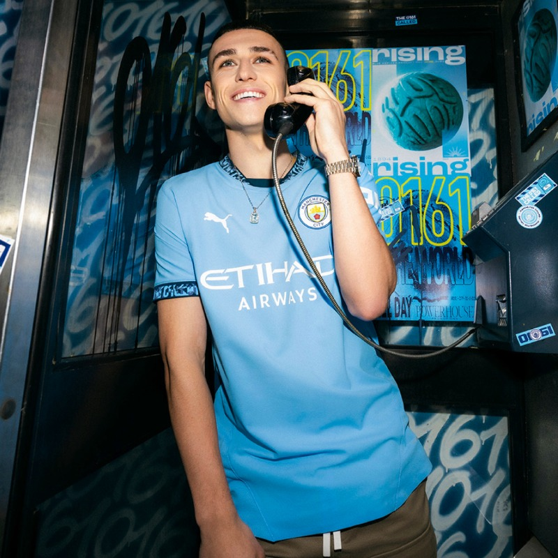
Yes, as you can see, although not much has changed on the kit made by Puma and it’s still very much sky-blue, the design of Man City’s 24/25 home shirt revolves almost entirely around the number 0161.
ADVERTISEMENT
Designating the area code for Manchester phone numbers and having become a shorthand for the city for as long as we can remember, while it may be a recognised bit of slang predominantly used by the younger generation, it isn’t one that everyone necessarily likes.
Think of people who hate it when anyone says ‘Manny‘.
ADVERTISEMENT
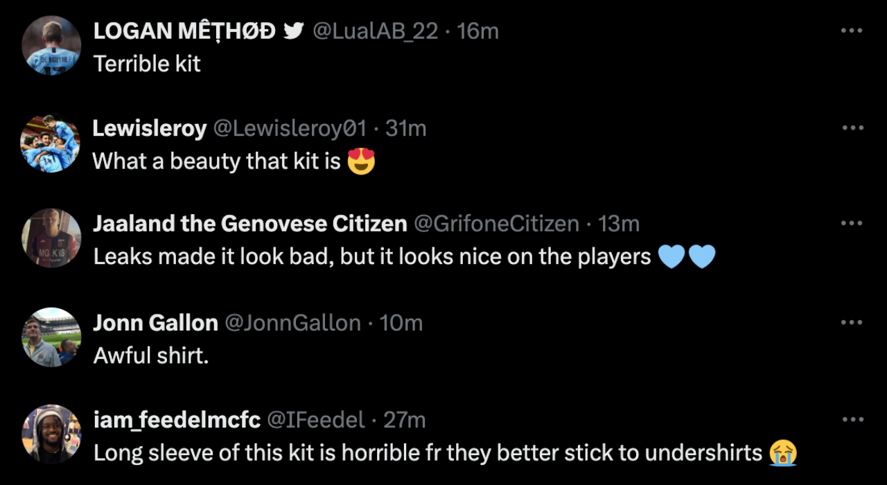
As always with new football shirts, the debate is split right down the middle; plenty of fans are labelling it “cold” and saying “what a beautiful kit”, others are saying they “hate it” or find it “cringe”, and a very big chunk lie somewhere in the middle – or “mid”, to quite many of the comments from youngsters.
Honestly, the further you scroll the less it seems like there’s a consensus on this one.
Just a handful of the varying reactions to City’s divisive new home kit. (Credit: X)
Naturally, a lot of people have simply quipped “Same every year” and others just seem to have grown tired of Manchester clubs calling on ‘tired’ emblems and references like 0161.
ADVERTISEMENT
Featuring not only the new collar but also the cuffs of the sleeves and obviously being central to the launch advert and their entire marketing strategy, the angle doesn’t chime with everyone.
Local fan Charlie told us: “I’m personally not a massive fan of it. I understand they’re trying to connect with the youth a bit more and almost mix it with street culture, but it just seems super tacky”.
Another lifelong Blue added: “I don’t think it looks as bad as the leaks made out now I’ve seen it on but I still think the constant pandering to MCR is cringe from both [City and United]. If they have to do it just keep it on the third shirt, even though you can’t actually see the 0161 that much.
They really hammered it home by getting Manc rapper Mike ‘Tays’ Taylor (known as Tays MCR online) to write a whole song themed around the number 0161 for the kit launch, though the reception to the song and the video itself has been largely positive.
The 24/25 City home shirt is available to buy online and in stores now.
Personally, we don’t mind the whole 0161 thing over here at The Manc and, let’s be honest, most footy kits don’t change that much year on year, do they?
ADVERTISEMENT
Yes, it might not be hugely different or distinct from previous years under Puma but, as many have also written in the comments, they still probably end up going and buying it anyway.
What do you make of Man City’s new home kit for next season?
AO Arena are hosting an ‘Evening 4’ Ricky Hatton in memory of the legendary Manchester boxer
Danny Jones
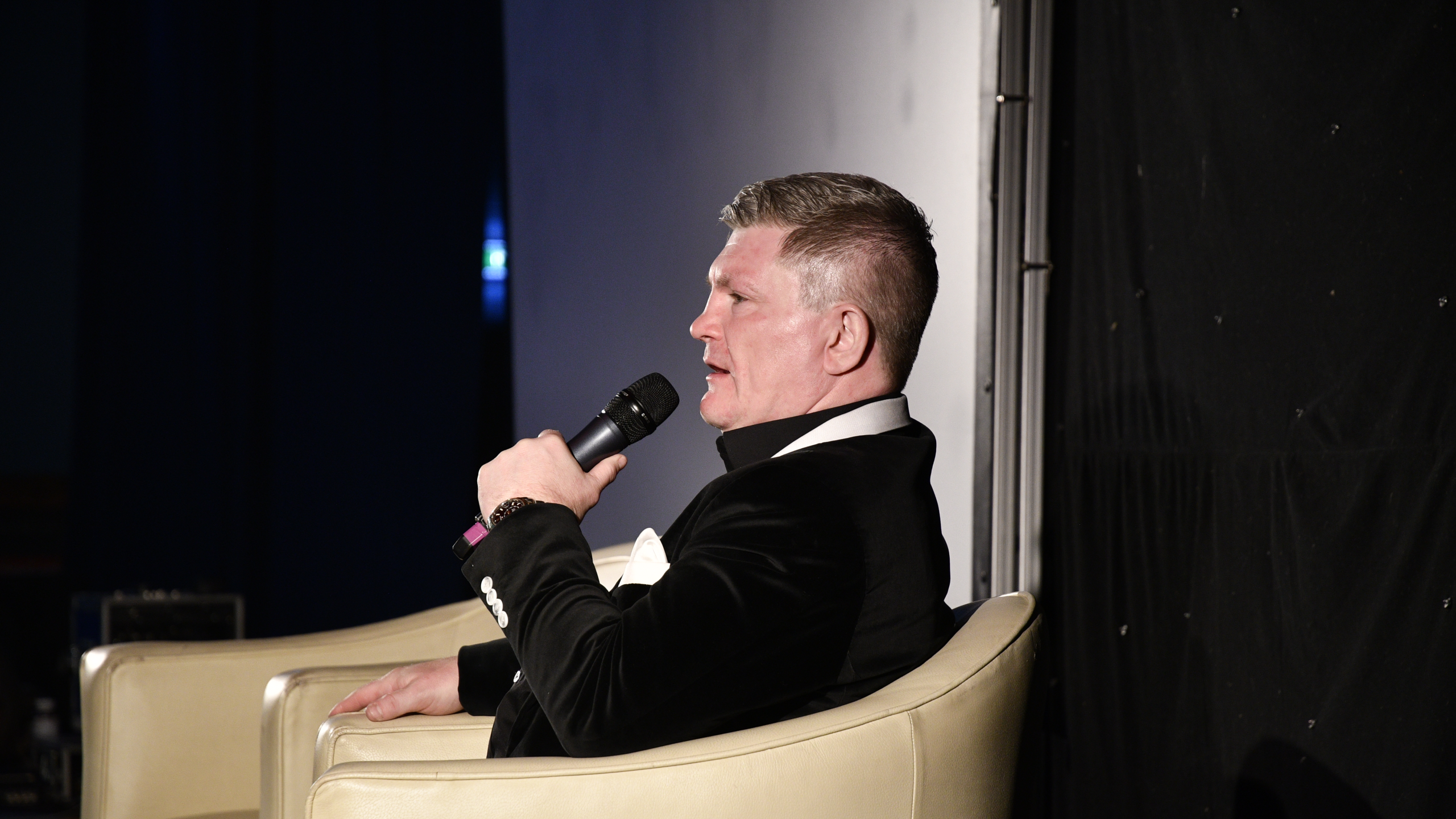
Manchester is set to host a night of remembrance and celebration in honour of the late, great, local boxer, Ricky Hatton.
Coming this summer, the AO Arena – where Hatton enjoyed so many of his iconic moments – will be holding the first-ever ‘Evening4Ricky’ later this year.
Held at the legendary sports and live entertainment venue just in time for summer, we still know very little about what the actual event will entail.
Sharing the news on social media, AO Arena said: “Join us for an unforgettable night of entertainment as Manchester comes together for Evening4Ricky.
“This will be a spectacular, unique celebration of the life, spirit and legacy of one of the city’s most beloved icons – Ricky ‘The Hitman’ Hatton.”
With seats priced at £25, fans are being encouraged to join the early bird sign-up to secure access to discounted tickets.
They go on to add: “Hosted at the legendary AO Arena, home to so many of Ricky’s big fights, featuring a superstar cast of legends from the worlds of boxing, music, comedy and entertainment.”
So, we do at least know there’ll be some famous faces coming along to help make it a memorable Manc moment, just a few months on from the city and beyond uniting for his public funeral procession.
Ricky was beloved not only by the Greater Manchester community but was a popular figure and friend to many in the sporting and showbiz industries.
The homegrown ‘Pride of Hyde‘ tragically left us on 14 September 2025 at the age of just 46, but his passing has once again helped reassert the importance of having more conversations around wellbeing, suicide prevention, and most specifically, men’s mental health.
You can find more information and see how to grab tickets right HERE.
This isn’t the only charitable in memoriam event happening across the region in the coming weeks, either, as Mancs will be gathering to pay tribute to another fellow inspiring sportsman.
Greater Manchester’s World Cup warm-up – how to get ready for the 2026 tournament this summer
The Manc
Are you getting your practice in, too? It’s a team effort.
With the World Cup fast approaching, we thought we’d share some exciting footy and other sports-related activities available across Greater Manchester this Spring, to help get your heads in the game.
Now that this lovely sunshine has arrived, it’s time to start getting excited for a summer filled with football, barbecues and crowding around a big screen. Don’t know what to do with yourself until 11 June? Don’t panic, we’ve done the work for you.
Here’s a list of both free and paid activities for you to do with friends or family.
Check out the fixture list this spring…
1. ‘LOWRY 360’: Going to the Match – The Lowry Theatre, Salford
The UK’s first free and permanent immersive experience, which allows fans to transport themselves inside the art of LS Lowry.
Get lost within his famous painting ‘Going to the Match,’ in collaboration with Immersive Studio, to completely transport you to matchday, using sound and super-high resolution imagery.
It is a multi-sensory experience covering the experience and excitement of preparing for a game – it’s not one to be missed. Described as one of their most ambitious projects yet, expect to feel like you’re inside a booming Wembley on matchday.
2. The ‘Best Team On Paper’ Footy Quiz – The Loft Social, Stockport
Wednesday, 8 April
How’s your ball knowledge? Let’s find out at the ‘Best Team on Paper’ quiz in Stockport. Head down to Loft Social; at just £2.25 a ticket, it’s a great way to spend a midweek evening, consisting of footy trivia, catching up with friends and hopefully some winning. There’s a £75 bar tab, mystery shirts, special prizes and more to be won.
While you’re there, why not wander down to Little Underbank before kick-off at 7:30pm and try out one of their new bars or dinner spots? Our recommendations would be The Good Rebel for their outdoor seating or The Underbank for an unreal slice of Gatto sourdough pizza and some drinks.
Hurry, tickets were completely sold out last time. Find out more and see if you can grab yourself some sought-after tickets HERE. If you’ve not seen much about the venue before, look no further:
3. Girls’ Football Festival – Broadhurst Park, Moston
Wed, 15 April
Feeling inspired after the Lionesses brought home gold last year? Us too, here’s a great opportunity for 10-14-year-old footy-mad girls in Manchester.
Hosted by FC United of Manchester at their home ground, it’s going to be a day full of fun, meeting new people and learning some skills from expert coaches. The festival is open to all abilities, so whether you’re a pro like viral sensation Anna Panna or you’re looking to try something new, everyone’s welcome.
Come on, girls – let’s show ’em how it’s done. Find out more and sign up HERE.
4. Head Shoulders Knees & Goals – National Football Museum, Cathedral Gardens
Friday, 27 March – Sunday, 1 November
This is an exciting, full sensory experience for the whole family, in the Score Gallery at the National Football Museum (NFM).
Whether you’re into science or just have a love for the game, this is a great day out for both children and adults. Learn about the connection between the body and football, with attention to sport science, clothing, exercise and nutrition through an interactive experience.
This exhibition also delves into stories of identity, the matchday experience and the joy that football brings, through different sensory activities. Click HERE to find out more.
ADVERTISEMENT
5. ‘The Price of Passion’ – Football Museum, Cathedral Gardens
Thursday, 15 May 2025 – Wednesday, 30 September 2026
Might as well make a day of it.
While you’re at the National Football Museum, why not go and see the Price of Passion display in the Play Gallery? It was designed in collaboration with their new partnered Youth Advisory Group to explore financial barriers to football accessibility through the voice of the next generation.
The exhibition highlights the injustices some of our community face, regarding increasing matchday ticket prices and the consequent protests.
We don’t think anybody should be excluded from the football community, and this expertly highlights real issues faced by Mancunians. Let’s educate ourselves to better understand and support our community. Tickets are available now.
ADVERTISEMENT
Planning your Easter holidays? Make sure we're top of your list to experience why Football Matters.💚⚽
— Nat. Football Museum (@FootballMuseum) March 6, 2026
6. The Beautiful Game – NFM, Cathedral Gardens
Friday, 24 April
While you’re at it, here’s one for you music lovers: the National Football Museum is hosting a concert to celebrate music surrounding ‘the beautiful game’.
This concert draws the parallels between football, music and wider culture. While it presents the power behind the musical elements within a matchday experience, it also explores how identity and culture shine through music, from each of the wonderful cities across the country.
It’s set to be one to remember with familiar chants, anthems and music, both local and international, inspired by football. This celebration of culture and music is not one to miss, and it is guaranteed to get you in the spirit for the World Cup. Find out more down below.
Tameside Central Library (Wed, 1 April) and Denton West End Community Library (Sat, 18 April)
ADVERTISEMENT
The totally free theatre show ‘Footy Fairy Tales’ has come to Manchester and will be showing in libraries across Greater Manchester this April.
While designed for children ages 5 -11, this experience is fun for the whole family, whether you’re training your child up like Project Mbappe or if they just love theatre, this would be a great day trip for the Easter Holidays.
It combines storytelling and football to welcome those new to the game, as well as you experts. Everyone deserves to get involved in the World Cup, so go on down. Get your tickets HERE.
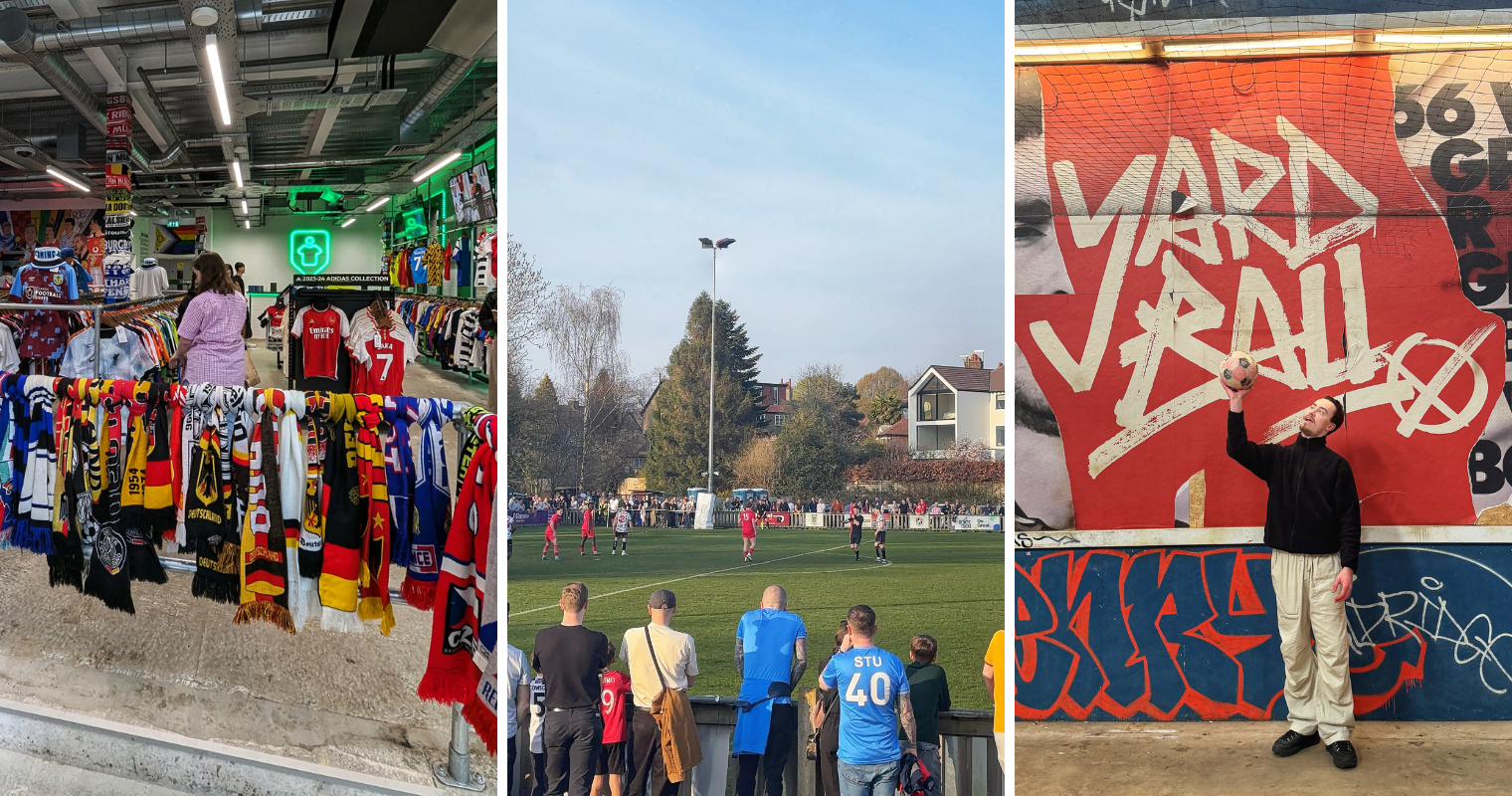
Let’s dress like winners. Why not head on over to the self-proclaimed ‘home of football shirts’ in the heart of our very own Northern Quarter? Check out their huge range of current and retro kits available for the whole family.
If you’re into modern streetwear or the history of football, this is the place for you. Established in 2006, with over 500,000 expertly selected, authentic vintage items, there is something for everyone.
ADVERTISEMENT
Don’t forget to check out their new adidas World Cup range of shirts to get you in the spirit. Nothing quite like a bit of retail therapy to get you in the mood for winning.
We still even reminisce about their old shop, and the operation has only grown since then.
9. West Didsbury and Chorlton AFC – Chorlton, Brookburn Park
Men’s at Home: Saturday, 11 April vs Prestwich Heys | Monday, 13 April v Cheadle Town | Wednesday, 15 April v Ramsbottom United
Women’s at home – Sunday, 19 Fleetwood Town
Come on down to support local grassroots football with West Didsbury & Chorlton AFC male and female teams down at Brookburn Road. With everything from a drummer at the shed end, dog-friendly fan hill, food, drink and more, it’s a class day out for all ages and people from all walks of life.
With three home games left for the men’s team and one for the women’s this April, come and support a local team that pride themselves on inclusivity and being an accessible local football club. The energy is electric, with a close-knit community feel that challenges prejudices in football.
Not to mention some sensational food, including burritos from WrapScallion, cakes from Sweet Talk and lovely pints from Monica’s Bar inside the clubhouse; at £8 a ticket on the gate, it’s a no-brainer.
10. Yard Ball – NFM, Cathedral Gardens
Last but not least, have you heard that the increasingly popular Yard Ball has popped up over at the NFM for the Easter bank holiday (and hopefully beyond)?
ADVERTISEMENT
Built around skills sessions, street football, and the backyard classic ‘bin game’, this increasingly popular activity is coming to Manchester city centre as the perfect distraction for your footy-mad little ones.
Having just opened up their latest full venue over in Sheffield, we know all too well how much time we could spend just playing this.
Honourable mention…
The University of Salford have joined up with Kick It Out, a charity on a mission to tackle all forms of discrimination. So, if you’re a University of Salford student, don’t miss out on access to multiple events and joining Kick It Out’s digital learning platform.
As a timely reminder that the people’s game is truly for everyone, there’s not much else left to say other than roll on this summer’s tournament, best of luck to England and… Oh, yeah: IT’S COMING HOME.