Whether you can believe it or not, someone has actually gone to the trouble of ranking the design of every single Council logo in the UK.
It’s mad, but the commitment to the cause can only be applauded.
There are a total of 403 Councils right across the UK which have been featured on this “totally objective” list compiled by freelance writer and graphic designer Robin Wilde – who also “once worked in politics” – and published to their blog website.
How have the logos been ranked? Robin explains that: “Each has been ranked using some broad criteria accounting for the adherence to design principles, the originality of the concept, and the technical execution, with nebulous bonus points added or subtracted on a whim.”
And out of the 403 Councils in the UK, Bury is at 402.
ADVERTISEMENT
“Bury sits north of Manchester,” Robin explains, “and is notable for having one of the UK’s largest Jewish population clusters outside of London [but] unfortunately, it’s also got a logo like a dodgy construction company you’d see on ITV2.
“Bury Council pay cash in hand for a skip they never bother to collect,” they conclude.
ADVERTISEMENT
Bury Council ranks the lowest on the list at 402 out of 403 / Credit: Bury Council
Credit: Manchester City Council | Tameside Council
Tameside Metropolitan Borough Council ranks at 275, Trafford comes in at 241, and Rochdale takes the 207th spot.
Manchester City Council itself then comes in at number 150.
Wigan takes 108th spot on the list, with its “understated and cute” heart and “generic colour combo” making the logo appear like “a mid-range gym chain”.
ADVERTISEMENT
105th place on the list goes to Salford City Council, with Robin saying that although they “adore the bold hot pink” and the font is “nicely chosen”, the logo “doesn’t quite justify the existence of a council area which should by rights have been absorbed into Manchester years ago.”
Oldham Council takes 88th spot on the list, with Robin Wilde writing: “A gradient fill is best avoided with logo work as it limits your range of use cases, particularly against busy backgrounds or when no colour can be used.”
“The overall look is striking at a glance, however,” they added.
Bolton Council takes the highest spot at 28 / Credit: Bolton Council
Stockport Metropolitan Borough Council has claimed 66 on this list, with it’s “crest, but make it tasteful” praised and noted that it “seems particularly prevalent in the North”.
Out of all the 10 Councils in Greater Manchester, it’s the borough of Bolton that has taken the highest spot on the list – and it’s the highest on the list by quite some way, we might add – coming in at number 28, with Robin Wilde explaining: “A solid slab serif wordmark on its own, it’s enhanced by its use in masking the colourful patchwork emphasising the city’s variety and diversity.”
ADVERTISEMENT
The number one spot on the list has been awarded to Bedford Borough Council, which was praised for its “very strong use of pretty much every element” in its logo.
York, Renfrewshire, Wirral, and West Lothian each round out the top five.
Featured Image – Flickr | Bolton Council, Tameside Council, & Bury Council
Trending
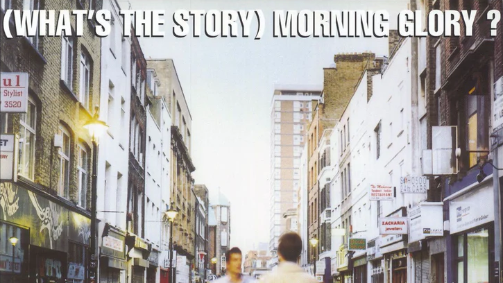
Oasis’ (What’s the Story) Morning Glory? named biggest UK studio album EVER by Official Charts
Danny Jones
You’re damn right: Oasis continue to be MASSIVE as new figures from the Official Charts Company have confirmed that (What’s the Story) Morning Glory? has clocked in as the biggest UK studio album of all time.
The Britpop icons and history go hand in hand.
Yes, according to the latest numbers by our domestic chart-crunchers, only two other albums surpassed Oasis‘ second LP – and they’re both greatest hits collections.
The announcement was made on Wednesday, 22 July, just over a whole year on from those reunion world tour shows at Heaton Park. How fitting.
Starting off by channelling Liam Gallagher energy and quipping that “Oasis vibes are in the area”, they go on to explain the colossal cumulative record.
“Oasis claim one of the biggest honours in British music history, they write, “as (What’s the Story) Morning Glory? is named the UK’s Official biggest studio album of all time, according to new Official Charts Company data.”
Combining UK sales of the record – both physical and digital over the years – along with modern streaming statistics, the sophomore outing from the Britpop giants has amassed approximately 6.2 million UK chart units. Staggering stuff.
Last year’s Live ’25 shows have no doubt helped give an added boost to their metrics, but it’s still gargantuan stuff from the local band.
Yet another incredible stat not just for the Burnage boys but the Manchester music scene as a whole.
2026 looks to be just as big a comeback, by the looks of things.
In case you were wondering who beat them out in the race for the top spot, they were pipped to the post by Queen’s Greatest Hits and the same again from ABBA, two worthy opponents to take third place after.
You can see the rest of the list in full right HERE.
Oh, and Definitely Maybe also made the list, too, coming in at number 39 – making that two in the top 50 even amongst all the compilations.
It feels like last July all over again, doesn’t it? And if now isn’t the perfect time to stick on the title track, we don’t know what is.
Actually, sod it – we’re sticking the full thing on…
Manchester City auctioning off exclusive ‘artefacts’ from Pep Guardiola’s office
Danny Jones
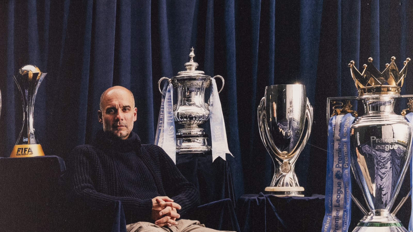
Manchester City are set to auction off a limited number of used and/or signed items previously owned by legendary football manager Pep Guardiola himself.
The iconic Catalan head coach may have now left the club, but it’s fair to say that supporters are still grieving the bittersweet goodbye – and if you’re one of them, then this might be a good way of clinging on to him and the memories.
Teaming up with MatchWornShirt, an authentic collectables company that deals in memorabilia used by the sporting stars themselves, fans will soon be able to own a ‘piece of Pep’ if they so wish as part of this very special merchandise dump.
So, if you’re a collector of signed or match-worn merch, here’s a taster of what’s up for grabs:
Several items from @PepTeam's office are up for auction 🤝
Yes, should they be willing to put in the winning bid, Blues can genuinely own some of Guardiola‘s office knick-nacks, a tactics board and notes scribed on by the man himself, as well as his actual chair and even his whistle.
Does that count as kissing him? That’s not for us to say…
There is more standard fare, of course, such as worn training kits, photo frames, programmes and other printed media – almost all of which are signed by the 55-year-old.
On the other hand, if you’re so inclined to go for the super rare stuff, you can even buy his desk lamp and go-to coffee cups; whatever floats your boat.
The former Barcelona and Bayern Munich boss left Etihad Stadium this summer after 10 years as a Cityzen – with the club even releasing a dedicated ‘Decade Collection’ in his honour – and it now looks as though he could be set for his next job.
His former assistant turned replacement and ex-U23s/Elite Development Squad (EDS), Enzo Maresca, is now in place and making his first impressions on the City squad; safe to say it’ll take some work to leave the same lasting legacy as his mentor.
As for the auction, the club have labelled these exclusive trinkets as “artefacts”, promising that you won’t get many other opportunities, if any, to claim this kind of ‘KeePepsake’.
Meanwhile, in other MCFC news, the City Football Group (CFG) are taking steps to ensure local fans have easier access to matchday tickets with a new postcode lottery, of sorts.