Manchester City split opinion with new home kit for 2024/25 season
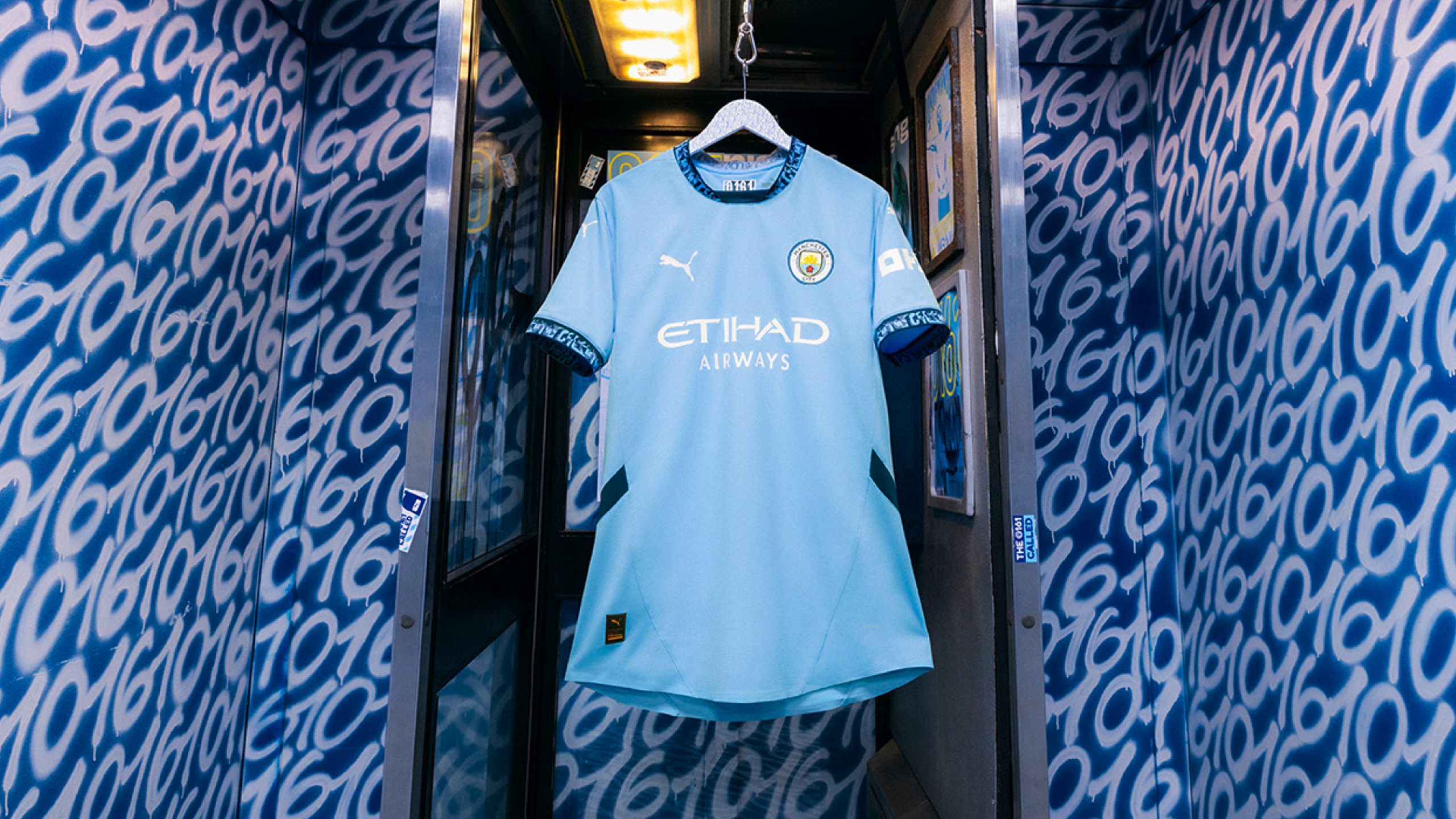
Manchester City have officially unveiled their new home kit for the 2024/25 season and it’s safe to say the central feature has left fans divided.
Dropping shirt fresh from having taken control of this year’s title race going into the final day of the Premier League this weekend, with a record-breaking four in a row now looking more likely than ever, you could argue there’s no better time to reveal how they look while defending the trophy next season.
However, amongst the supporters – be they Blue or otherwise – it seems that a lot of people have been left torn over one key, defining detail on City‘s new home shirt.
It’s that pesky ‘0161’ again.
Yes, as you can see, although not much has changed on the kit made by Puma and it’s still very much sky-blue, the design of Man City’s 24/25 home shirt revolves almost entirely around the number 0161.
Designating the area code for Manchester phone numbers and having become a shorthand for the city for as long as we can remember, while it may be a recognised bit of slang predominantly used by the younger generation, it isn’t one that everyone necessarily likes.
Think of people who hate it when anyone says ‘Manny‘.
As always with new football shirts, the debate is split right down the middle; plenty of fans are labelling it “cold” and saying “what a beautiful kit”, others are saying they “hate it” or find it “cringe”, and a very big chunk lie somewhere in the middle – or “mid”, to quite many of the comments from youngsters.
Honestly, the further you scroll the less it seems like there’s a consensus on this one.
Naturally, a lot of people have simply quipped “Same every year” and others just seem to have grown tired of Manchester clubs calling on ‘tired’ emblems and references like 0161.
Featuring not only the new collar but also the cuffs of the sleeves and obviously being central to the launch advert and their entire marketing strategy, the angle doesn’t chime with everyone.
Local fan Charlie told us: “I’m personally not a massive fan of it. I understand they’re trying to connect with the youth a bit more and almost mix it with street culture, but it just seems super tacky”.
Another lifelong Blue added: “I don’t think it looks as bad as the leaks made out now I’ve seen it on but I still think the constant pandering to MCR is cringe from both [City and United]. If they have to do it just keep it on the third shirt, even though you can’t actually see the 0161 that much.
They really hammered it home by getting Manc rapper Mike ‘Tays’ Taylor (known as Tays MCR online) to write a whole song themed around the number 0161 for the kit launch, though the reception to the song and the video itself has been largely positive.
Read more:
- Stockport County to supply thousands of free PE kits to local kids
- Manchester City Under 18s win the coveted FA Youth Cup in comfortable fashion
- Cult favourite Northern record shop launches their own retro football kit
Personally, we don’t mind the whole 0161 thing over here at The Manc and, let’s be honest, most footy kits don’t change that much year on year, do they?
Yes, it might not be hugely different or distinct from previous years under Puma but, as many have also written in the comments, they still probably end up going and buying it anyway.
What do you make of Man City’s new home kit for next season?
For all the latest news, events and goings on in Greater Manchester, subscribe to The Manc newsletter HERE.
Featured Images — Manchester City/Puma
